As we move closer to our upgrade of D2L to what is called The Daylight Experience, I have begun to publish a series of posts showing you what the various tools will look like come May. My last post gave you a glimpse of the new Daylight homepage design.
And now that you have seen what the new Daylight course homepage will look like, it’s time to take a brief look at some of the other tools in D2L and what they will look like in Daylight. Today we will look at the Content tool.
In general, the changes to the Content tool, as with most of the tools, are visual: the white background, the larger font size, all those things that lend themselves to the responsiveness of the design for mobile devices.
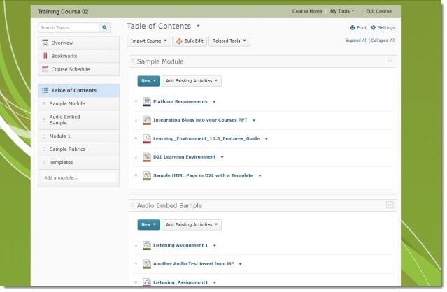
Here is what the Content tool looks like now. Note the placement of the content tool in the course page set against the green background.
And here is what it will look like in Daylight. Note that the Content tool takes up the whole page space, there is no colour background, and how you can see less of the content on the main page without scrolling than you can in the current version.
Now, let’s take a side-by-side look at the content in one of the modules.
 |
 |
Not too many changes here, but there are a couple of things to notice. First, in the Table of Contents box, note that the open module is much easier to see in the current version than in Daylight. You really need to look at the main page to see which module is open. Also, in Daylight, the icons have been redesigned, and there is text indicating whether the content is a PDF document, a Link, a Web Page, etc. Here’s a closer look at the Daylight icons here:
One final change is with the Upload File interface.
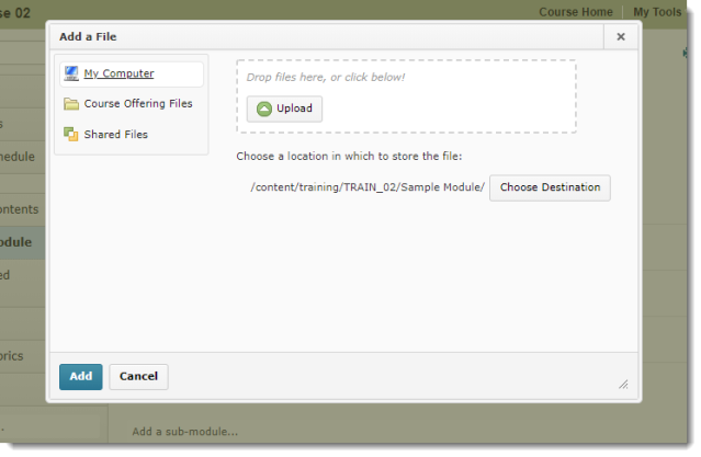
In the current version, if you click New and Upload File, the upload box gives you options of where to upload files from, AND the Upload interface:
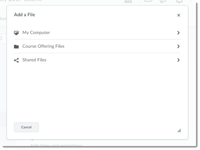
However, in Daylight, the initial upload box you will see gives you the option of selecting files from My Computer, Course Offering Files, or Shared Files.
In this box, you need to select where the file will be uploaded from before you can select a file, so if you click on My Computer, you will then be able to upload a file from your computer.
Aside from these design changes, the Content tool looks and functions the same as it does in the current version, and rest assured that all your content will still be in your courses after the upgrade!
Next time we will have a look at the Grades tool!


