As we move closer to our upgrade of D2L to what is called The Daylight Experience, I have begun to publish a series of posts showing you what the various tools will look like come May. So far, we have looked at the changes to the Content, Grades, and Dropbox tools. Today we will begin our look at the Quizzes tool.
Similarly to other changes I have shown you in previous posts, the changes in the Quizzes are primarily visual, rather than functional, except for some of the question creation interfaces. This post, however, will look at the visual changes in the Quizzes tool itself, while my next post will give you a tour of some of those question creation changes, which are both visual and functional!
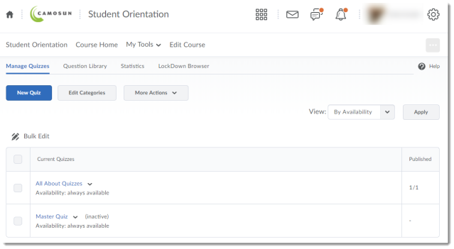
Here is what the main Quizzes area looks like now.
And here is what it will look like in Daylight. Notice that the table is much bigger, although it contains all the same rows and columns.
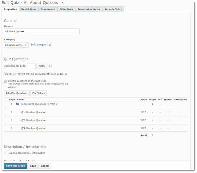
Now let’s take a look at the Edit Quiz area. Here is what it looks like in the current version.
And now, see that in Daylight, as with other tools, the editing area takes up much more room due to default font size and cell padding, so even though this Daylight quiz has the same number of questions in the Pre-Daylight quiz shown above, you would have to scroll down to see all the questions.
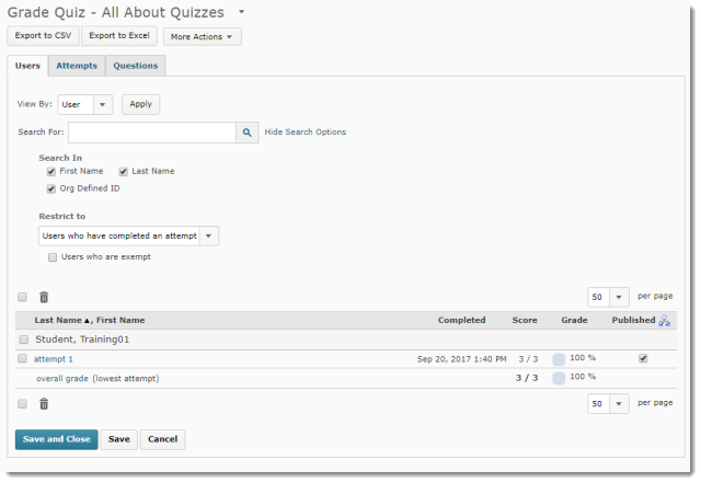
Now let’s look at the quiz grading area. In the current version, here is what we see on the initial Grade Quiz area.
And in Daylight:
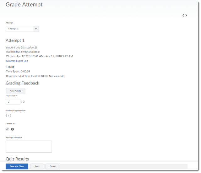
Now, to grade a quiz, here is what you see in the current version
And now, in Daylight. Note that for this screen capture, I zoomed out in the browser to 80% of the default size so you would be able to see a bit more of the grading area here.
In my next post, I will show you the Question Library, specifically the changes in the question creation interface for several question types.


