As we move closer to our upgrade of D2L to what is called The Daylight Experience, I wanted to publish a series of posts showing you what the various tools will look like come May.
Today, we will be looking at the D2L default course homepage. If you have a customized homepage, you may see more widgets, more columns, etc. on your own homepage than you will see here, but be aware that there are some design features associated with our current version of D2L that you won’t be able to customize in Daylight. Let’s have a look.
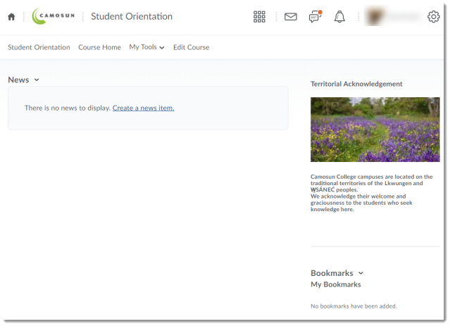
When a new course shell is created in Daylight, this is what you will see:
Compare this to the current version:
To detail some of the changes you can see above:
- As you can see in the images below, the “minibar” at the top of the Daylight page (which is a black bar at the top of the current version of D2L) has changed the My Home link to an icon that looks like a house, and changed the Select a course drop-down menu to a checkerboard-like icon (next to the email notification icon). The minibar will still appear on the Camosun D2L homepage, as well as on every page of your own course sites.
Current version:

Daylight – note the change of My Home and the Select a course menu to icons:

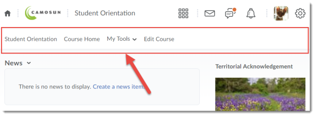
- As you can see below, the default placement of links on the course NavBar has moved to the left-hand side. In Daylight, you cannot move the links to the right-hand side, but you can still add or delete items from the NavBar.
Current version – links on the right side:

Daylight – links on the left side:

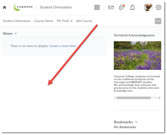
- Due to the responsive re-design of D2L (meaning that the Daylight interface will adjust to any size device now), there is no longer an option to customize the colour scheme on the homepage (in other words, no coloured swoosh in the background).
Current version – beautiful swoosh that can be colour-customized:

Daylight – white background only:

- Similarly, there is no longer an option to customize the design of the widgets (e.g., you can’t change the title bar of the widgets, or add a border to them).
Current version, showing possible design options for widgets on the homepage:

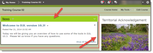
- On the good news side of things, you no longer have to worry about accidentally collapsing the News widget! In the current version, if you click on the widget title bar, the widget collapses (closes), which makes it easy for students to collapse it without realizing they have done so. But now you have to work harder to collapse those widget by clicking on the drop-down menu to collapse widgets.
Current version – as you can see it’s easy to close that widget and not notice:

In my next post, I will give you a tour of what the main tools in D2L will look like in Daylight.


