As we move closer to our upgrade of D2L to what is called The Daylight Experience, I have begun to publish a series of posts showing you what the various tools will look like come May. My last post gave you a glimpse of the new Daylight Content tool design. Today we will look at the Grades tool.
Similar to the changes in the Content tool, the changes to the Grades tool from our current D2L to Daylight, are about the visual: the white background, the larger font size, more space between items in tables, etc.
So, without further ado, let’s have a look at the changes.
Here is what the Manage Grades area looks like now.
And here is Manage Grades in Daylight. Notice the change in spacing in the table. This gradebook is identical to the one presented above, but you will not be able to see all the items on one page – you will have to scroll to see the whole thing. Otherwise, the Manage Grades area in Daylight functions the same as it does in the current version.
Now, let’s look at the Enter Grades area. Here it is in the current version.
Now, here it is in Daylight. Notice again the larger table size which will lead to more scrolling, the more students there are in the list. Notice also that, in addition to the scroll bar at the bottom of the page (which you also see in the current version), there is a scroll arrow at the top of the table.
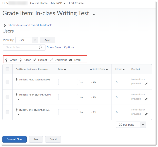
When grading an item, choosing Grade All in the drop-down menu for a grade item (here, for In-class Writing Test), here is the current interface:
And here is the Daylight interface. Notice that the tool icons (Grade, Clear, Exempt, Unexempt, and Email) only appear at the top of the table (and that the icons have been updates, and are in black and white).
Finally, we will look at previewing a student’s gradebook. First, clicking on a student’s name, then selecting Preview from that student’s drop-down menu (the grading interface for an individual student has not changed). If you are not sure how to preview a student’s gradebook, see the Previewing a Student’s Gradebook pdf.
Here is what this looks like in the current version:
And here is what it looks like in Daylight. Same gradebook, taking up much more space! And no, the name of the student still does NOT appear at the top of the pop-up window with their gradebook preview…sigh…
To wrap this up, I’ll note that both the Schemes and Settings area have not changes, except visually. You can expect all the same functionality in the Grades tool (for good or bad) in Daylight that you have in the current version of D2L.
Next time, we will have a look at Dropbox in Daylight!


