As we move closer to our upgrade of D2L to what is called The Daylight Experience, I have begun to publish a series of posts showing you what the various tools will look like come May. So far, we have looked at the changes to the Content and the Grades tools. Today we will look at the Dropbox tool.
Similarly to the changes in the Content and Grades tools, the changes in Dropbox are visual, rather than functional.
Here is what the main Dropbox area looks like now.
And here is what it will look like in Daylight. Notice that the table is much bigger, although it contains all the same rows and columns.
As with all the tools in D2L, the icons denoting specific functions have changed. You will still recognize the pencil (for edit), the trash can (for delete), and the people (for Groups). The icon noting the connection of a Dropbox to a Grade item has, however, changed from a ruler (see left image below) to a ribbon (see right image below).
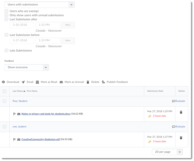
Now, let’s take a look at the Folder Submissions area.
Here it is in the current version:
And here is what the Folder Submissions area will look like in Daylight – I’m dividing it into 2 screen shots so you get a better example of the size difference.
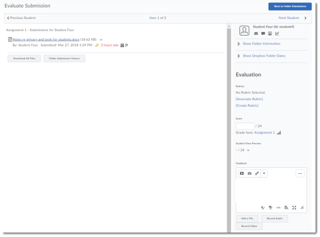
And finally, here is the individual student Evaluate Submission area, first in the current version:
And now, in Daylight
And there you have it – the Dropbox in Daylight. In my next post, we will start looking at the Quizzes tool and Question Library.


