New Assignment Types in D2L Dropbox

If you use the assignment Dropbox in D2L, you may have noticed some new options for acceptable assignment types.

Previously, students had to submit a file to Dropbox in order to complete a submission.  Now, this is not mandatory!  Instead of a File Submission dropbox, you can now create Dropboxes for:

  • Text submission (so students can write a one-paragraph text without uploading a file, or embed an audio file, a video, an image, etc. into the HTML editor)
  • On-paper submission (allowing you to use the Dropbox to give feedback for something submitted in class)
  • Observed in person (allowing you to use the Dropbox to give feedback for an in-class presentation, for example)

Selecting the Assignment Type for your Dropbox is simple.  First, go to the Dropbox tool in your course.  Then click New Folder.

click New Folder

Give your Folder a Name, then scroll down to the Submission, Completion and Categorization section.  Click the Submission type drop-down menu and select the submission type you want.

Scroll down and select your Submission type

If you select Text submission, you don’t need to do anything else.

If you select On paper submission or Observed in person, you will also need to click the Marked as completed drop-down and select one of the following choices:

  • Manually by learners (the students will get a Mark as complete button to let you know that they have completed the assignment)
  • Automatically by evaluation (the assignment will be marked as completed once you, as the instructor, evaluate it)
  • Automatically by due date (the assignment will be marked as completed on the due date if one is set)

You can then finish setting up your Dropbox (adding your due date, etc.) and click Save and Close when you are done.  If you want to see what a student sees, you can then Preview the Dropbox to make sure the assignment type you selected is indeed the one  you want.

Note:  Once you select an Assignment Type for your Dropbox and save it, you can’t change it, so if you choose the wrong assignment type, you will have to delete the dropbox and create a new one.

Introduction to Daylight, Post 6: New Question Creation Interfaces

As we move closer to our upgrade of D2L to what is called The Daylight Experience, I have been publishing a series of posts showing you what the various tools will look like come May.  So far, we have looked at the changes to the Content, Grades, Dropbox, and Quizzes tools.   Today we will finish our look at Daylight with a tour of some of the new Question creation interfaces in the Question Library.

As I noted last time, the changes in the Quizzes are primarily visual, rather than functional. That is, except for some of the question creation interfaces. We’ve now looked at the visual changes in the Quizzes tool itself, and in this post, I will give you a tour of the changes in the question creation interfaces for True/False, Multiple Choice, Short Answer, and Written Response questions.

Note that this will be my last “peek of Daylight” post as we will be making final preparations for our upgrade next week. Stay tuned for posts covering some cool feature changes that have been appearing in D2L (current and Daylight) over the past few months.

Before we start looking at the question creation interfaces, here is the Question Library area in the current version of D2L.

Pre-Daylight Question Library

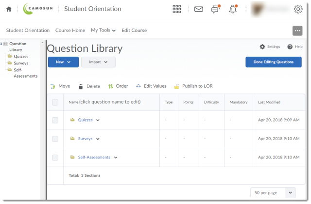
And here it is in Daylight.

Daylight Question Library

Now, let’s create a True/False question. Remember, to create a question, click the New button and select the question you wish to create.

Here is the True/False question creation interface in the current version of D2L. I have reduced the browser view size by 30% so you can see more of the interface.

Pre-Daylight True False question creation interface

Now, here is the True/False question creation interface in Daylight. Notice that the interface has been simplified so that everything you need to create a True/False question is on one page (no scrolling needed). Just add your Question Text, select the correct answer (True or False), change the Default Points, if needed, and click Save.

Daylight True False question creation interface

If your monitor is large enough, you can see the Preview pane on the right side of the creation interface.

Daylight True False Preview pane

Otherwise, you can click Preview to see the question preview, and click Done when you have finished viewing the Preview.

Daylight True Falce Preview button

Daylight True False Done Preview

Now let’s take a quick look at the Multiple Choice question creation interface. Here it is in the current version. I’ve shown it in two screen shot, as it is a very long interface!

Pre-Daylight Multiple Choice question creation interface 1 Pre-Daylight Multiple Choice question creation interface 2

Now, here is the Multiple Choice creation interface in Daylight. Note the Preview pane on the right.

Daylight Multiple Choice question creation interface

And now, here is the Written Response question interface in the current version (note that Written Response used to be called Long Answer).

Pre-Daylight Written Response question creation interface

And here is the Written Response interface in Daylight.

Daylight Written Response question creation interface 1

Note that you can click Options and select Add Custom Response Box Size to choose what size of text box your students will have to answer the question.

Finally, here is the Short Answer creation interface in the current version of D2L.

Pre-Daylight Short Answer question creation interface

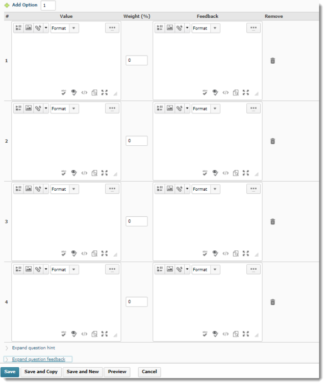
And here it is in Daylight. You can have multiple possible answers in blanks, add Blanks, assign how many points each blank has, and decide if the answers need to be case-sensitive. To find out more, register for one of our quiz workshops this spring (https://www.surveymonkey.ca/r/DLMPPR5)!

Daylight Short Answer question creation interface

Note that eventually all the question creation interfaces will have the same design. These will change as we continue our monthly updates after the major upgrade on April 30th.

Thanks very much for reading my Daylight upgrade posts over the past few months. Next month I will be resuming regular posts about our monthly feature changes, tips for how to use some of the tools, and other exciting things happening in eLearning.

Introduction to Daylight, Post 4: The Dropbox Tool

As we move closer to our upgrade of D2L to what is called The Daylight Experience, I have begun to publish a series of posts showing you what the various tools will look like come May.  So far, we have looked at the changes to the Content and the Grades tools.   Today we will look at the Dropbox tool.

Similarly to the changes in the Content and Grades tools, the changes in Dropbox are visual, rather than functional.

Here is what the main Dropbox area looks like now.

Pre-Daylight Dropbox

And here is what it will look like in Daylight. Notice that the table is much bigger, although it contains all the same rows and columns.

Daylight Dropbox

As with all the tools in D2L, the icons denoting specific functions have changed. You will still recognize the pencil (for edit), the trash can (for delete), and the people (for Groups). The icon noting the connection of a Dropbox to a Grade item has, however, changed from a ruler (see left image below) to a ribbon (see right image below).

Pre-Daylight Dropbox icons Daylight Dropbox icons

Now, let’s take a look at the Folder Submissions area.

Here it is in the current version:

Pre-Daylight Folder Submissions area

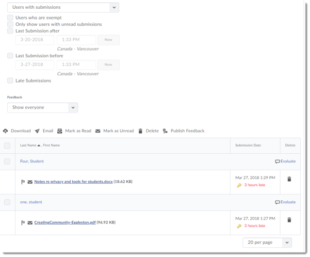
And here is what the Folder Submissions area will look like in Daylight – I’m dividing it into 2 screen shots so you get a better example of the size difference.

Daylight Folder Submissions area part 1

Daylight Submissions area part 2

And finally, here is the individual student Evaluate Submission area, first in the current version:

Pre-Daylight individual submissions area

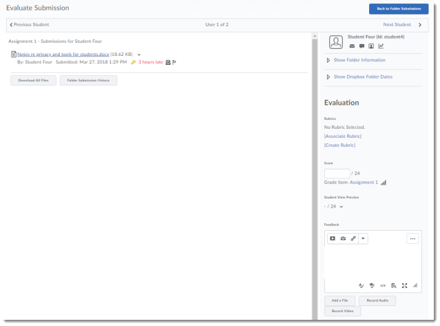
And now, in Daylight

Daylight Dropbox individual submissions area

And there you have it – the Dropbox in Daylight.  In my next post, we will start looking at the Quizzes tool and Question Library.

Introduction to Daylight, Post 3: The Grades Tool

As we move closer to our upgrade of D2L to what is called The Daylight Experience, I have begun to publish a series of posts showing you what the various tools will look like come May.  My last post gave you a glimpse of the new Daylight Content tool design.  Today we will look at the Grades tool.

Similar to the changes in the Content tool, the changes to the Grades tool from our current D2L to Daylight, are about the visual: the white background, the larger font size, more space between items in tables, etc.

So, without further ado, let’s have a look at the changes.

Here is what the Manage Grades area looks like now.

Pre-Daylight Manage Grades area

And here is Manage Grades in Daylight. Notice the change in spacing in the table. This gradebook is identical to the one presented above, but you will not be able to see all the items on one page – you will have to scroll to see the whole thing. Otherwise, the Manage Grades area in Daylight functions the same as it does in the current version.

Daylight Manage Grades area

Now, let’s look at the Enter Grades area. Here it is in the current version.

Pre-Daylight Enter Grades area

Now, here it is in Daylight. Notice again the larger table size which will lead to more scrolling, the more students there are in the list. Notice also that, in addition to the scroll bar at the bottom of the page (which you also see in the current version), there is a scroll arrow at the top of the table.

Daylight Enter Grades area

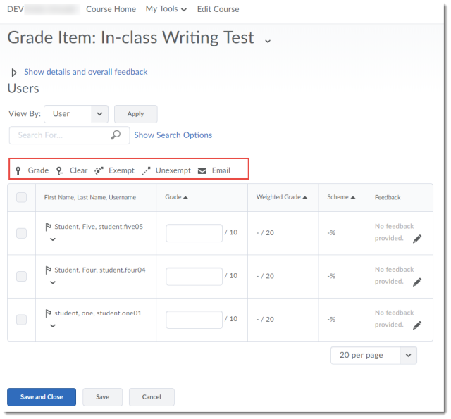
When grading an item, choosing Grade All in the drop-down menu for a grade item (here, for In-class Writing Test), here is the current interface:

Pre-Daylight Grade All Item area

And here is the Daylight interface. Notice that the tool icons (Grade, Clear, Exempt, Unexempt, and Email) only appear at the top of the table (and that the icons have been updates, and are in black and white).

Daylight Grade All Item area

Finally, we will look at previewing a student’s gradebook. First, clicking on a student’s name, then selecting Preview from that student’s drop-down menu (the grading interface for an individual student has not changed). If you are not sure how to preview a student’s gradebook, see the Previewing a Student’s Gradebook pdf.

Here is what this looks like in the current version:

Pre-Darylight Preview Student Gradebook

And here is what it looks like in Daylight. Same gradebook, taking up much more space! And no, the name of the student still does NOT appear at the top of the pop-up window with their gradebook preview…sigh…

Daylight Preview Student Gradebook

To wrap this up, I’ll note that both the Schemes and Settings area have not changes, except visually. You can expect all the same functionality in the Grades tool (for good or bad) in Daylight that you have in the current version of D2L.

Next time, we will have a look at Dropbox in Daylight!

Advance Notice: Camosun D2L is Upgrading!

Yes, Camosun’s D2L will be upgrading to the latest version, called the Daylight Experience!

When are we upgrading?

We will be upgrading D2L at the end of April 2018.  So, on May 1st, you will login as usual, but see a new bright and shiny D2L.

Why are we upgrading?

Well, the main reason is that the Daylight Experience version of D2L will be the only version available by the end of August, 2018.  But, we are also excited to be upgrading as Daylight Experience has been designed with mobile devices in mind!  So we are looking forward to a better experience for students who access D2L using their phones or tablets.

How different is this new D2L?

Do not fear! Many of you may remember the upgrade of almost 4 years ago when D2L changed significantly, but this upgrade will not be like that.  While D2L will look different, all the tools will continue to function as you are used to.  And everything you had on your course site on April 30th will still all be there for you on May 1st.

What’s it going to look like?

Here is a screen shot of what a default course homepage will look like (note that this may change a bit, depending on what additional changes are made before the upgrade):

How do I find out more?

During the 2018 Winter term (in March and April), we here in eLearning will be running information sessions at both campuses on the new version to prepare you for the change.  If you would like to talk to us about what impact the new version might have on your course, you can arrange to meet with one of our instructional designers – we will be happy to walk you through the changes.

Questions?  Contact me, Emily Schudel, at schudele@camosun.ca.