Adding Text or Images to Appear above a Set of Questions: A D2L Tutorial

This tutorial is for faculty who have previous experience using the Quizzes tool in D2L. For further information, please contact desupport@camosun.ca for assistance.

Scenario

This tutorial will cover the steps involved with making some of your quiz questions bonus questions (counting above the total grade for the quiz).

Steps

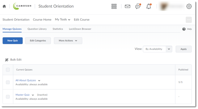
  1. Go to the Quizzes tool in your course.
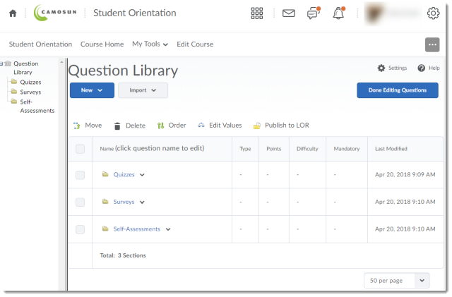
  2. Click Question Library.Click question library
  3. Select a Section to add your Text or Image information to, or create a new section (for the purposes of this tutorial, we want to create a Case Study text that accompanies a set of questions in the Week 1 Quiz, so we will click the Week 1 section to open it).Adding Text or Images to Appear above a Set of Questions – D2L Tutorial
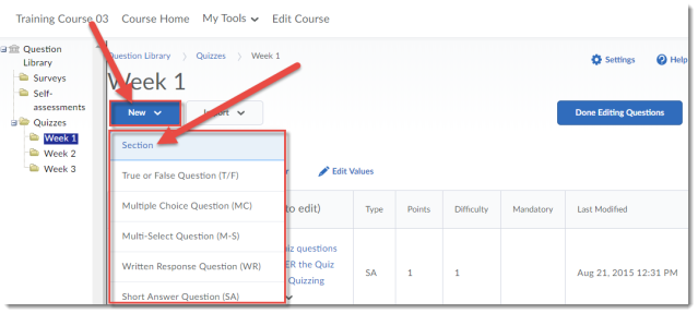
  4. Click New and select Section.Click New and select Section.
  5. Give your Section a Title and click Hide Section Title from students if you like (we will keep it unselected to show you want it looks like in a quiz). Add your text or image to the Section Text box. This is where your case study text would go, for example. If you would like all the questions in this section shuffled (so that each student sees the questions relating to the case study in a different order), click Shuffle questions in this section. Then click Save.Give your Section a Title and click Hide Section Title from students if you like. Add your text or image to the Section Text box. If you like, click Shuffle questions in this section. Then click Save.
  6. Click on the title of the Section you just created, and using the options under the New button, add your questions to it. Click Done Editing Questions when you have finished.Click on the title of the Section you just created, and using the options under the New button, add your questions to it. Click Done Editing Questions when you have finished.
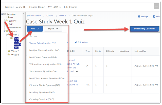
  7. Now, you can add your Section (along with your questions) to a Quiz. Click on the title of the quiz you want to add your Section to (or create a new Quiz).Click on the title of the quiz you want to add your Section to (or create a new Quiz).
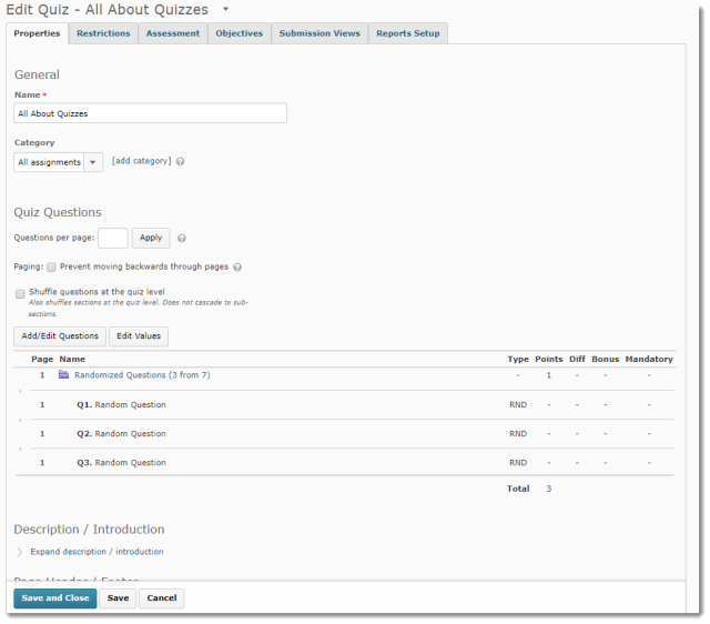
  8. If you need to, give your Quiz a Name, then click Add/Edit Questions.If you need to, give your Quiz a Name, then click Add/Edit Questions
  9. Click Import, and select Browse Question Library.Click Import, and select Browse Question Library.
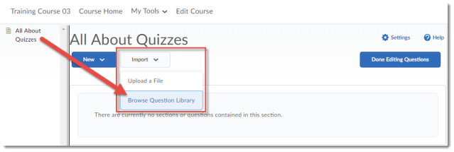
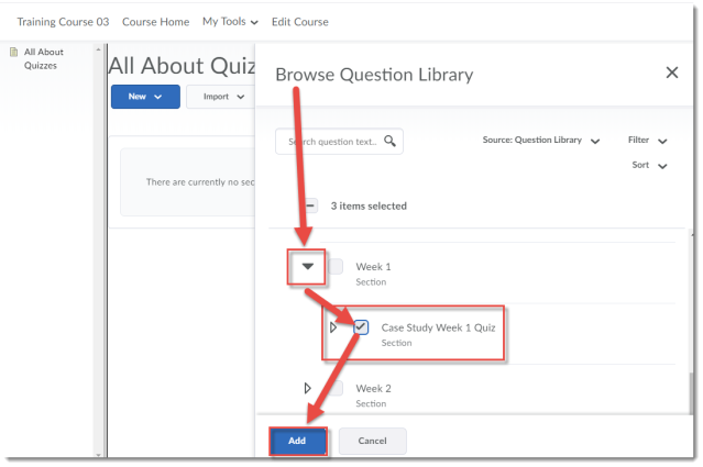
  10. Find your Section – you may need to scroll down in the Browse Question Library window and click the down arrows next to Section titles to open them to find it. Click the select box next to your Section, and click Add.Find your Section. Click the select box next to your Section, and click Add
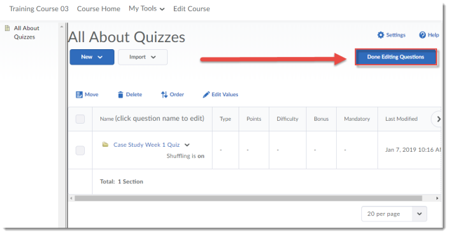
  11. Click Done Editing Questions.Click Done Editing Questions.
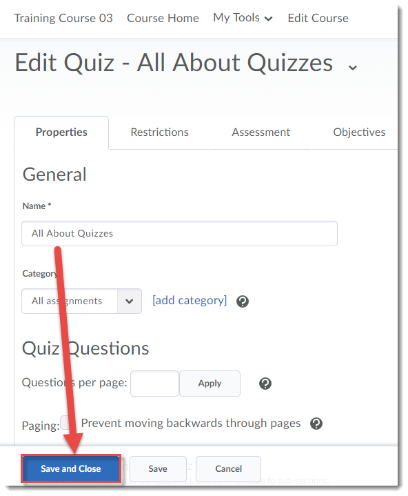
  12. Finish setting up your Quiz, then click Save and Close. Make sure to Preview your Quiz to check that your Section text or image appears above the questions you placed in it.Finish setting up your Quiz, then click Save and Close.

Things to Remember

NOTE: If you have old quizzes in your course site (for example, if you have copied them from Master or Dev or old course sites), you may have old versions of Text or Image information “question types” that have been converted into Sections called “Untitled [converted from a Text/Image Information Item]”. You will want to check your quizzes to make sure these sections work the way you want them to in the context of your quiz, and may even want to take the time to give them an appropriate title and move the questions the original “question type” was associated with so that they are inside the section.

Continuous Upgrade Post – Catch up from September through December

I have been sadly remiss in posting information about all the changes that have been happening in D2L with our monthly upgrades. So, what has been happening in D2L since September that you might want to know about? Here are some of the highlights:

September Updates

  • Students can now print or download content added to the Overview area in the Content tool.click Overview, then Print or download
  • You can now attach a Group to existing discussion topic while creating the group. You’ve always been able to create a Discussion Topic while creating a group, but now you can also select an existing Topic to attach a group to. You will find this option when you click Set up discussion areas, when creating a New Group. Select Attach to existing topic, and choose the Topic you want to attach your group to.

 Click Set up discussion areas, then Attach to existing topic, then choose your topic!

 October Updates

  • There are some new assignment types you can choose from in Dropbox, which means that students don’t have to necessarily upload a file for Dropbox to work properly. This will open all kinds of options for accepting embedded videos or audios (rather than students having to upload them and you having to download them – you will be able to play them right in D2L!), or setting up a Dropbox for assignments students hand in in class. I will post about this change separately so I can give you a closer look at how these new changes work! Stay tuned…
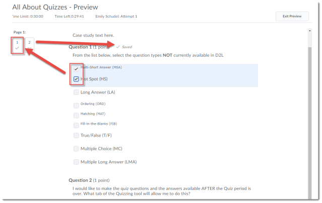
  • You may have noticed (or your students may have noticed, and may or may not have pointed out to you) that quiz questions now auto save. This means that students no longer have to click Save for each question (the Save button is in fact gone) – but their answers will be saved automatically once they answer the questions. Student do still need to Submit the quiz when they have finished it though!!Auto Save in a Quiz

December

  • In the new Question Creation Interface for Written Response questions, the option to add Initial Text for students has been added back!  See below for how this will now work:Click Options, then Add Intial TextAdd your initial text to the Intial Text box
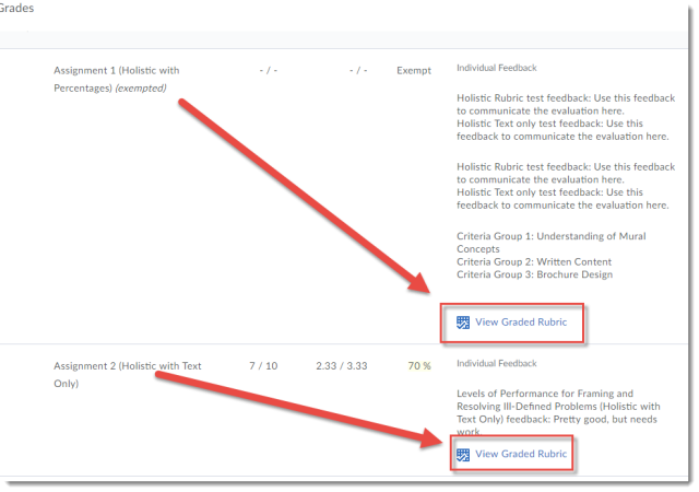
  • All graded rubrics, whether they are in Dropbox or Discussions, now will appear in a student’s Gradebook (if the Dropbox/Discussion is linked to a Grade Item). Below is a Preview of a student’s gradebook – the View Graded Rubric links are links to the rubrics as graded in Dropbox!Students can click View Graded Rubric in their Gradebooks

Next week I’ll let you know what is coming later this month for the first updates of 2019!

Introducing D2L to your Students

Last May, I ran a workshop for faculty called Introducing D2L to Your Students which asked “Using D2L, but not sure how comfortable your students are with it? Come and find out what other faculty at Camosun are doing to introduce D2L to their students.” The workshop outcomes invited participants to:

  • Decide how best to talk about D2L with your students
  • Rethink the assumptions we make about what students do or don’t know about D2L and accessing online resources
  • Integrate strategies for introducing D2L and referring to it throughout the term

During the workshop, participants discussed how they introduce, or might introduce, D2L to their students.  Expanding on their discussions, I shared what I have learned what faculty across the college are doing to introduce students to D2L, which ranges from nothing (typically assuming students will be able to figure it out for themselves), all the way to full scavenger hunts, and regular sessions in the lab using D2L.

So, here in this post, I now share with you the strategies which have been shared with me.  Faculty at Camosun who are introducing D2L to their students in some way are:

  • Providing students with information about D2L prior to the first class, typically via email (and in some cases via a physical letter). I have seen this being done at a Program level, as well as by individual instructors.
  • Creating handouts (or using the ones created by eLearning) to support students in their use of D2L.
  • Giving students a tour of D2L and the D2L course site on day one, for example,
    • Showing them how to log in;
    • Showing them how to set email forwarding and/or notifications;
    • Showing them all the tools that will be used during the course (or introduce tools throughout the term when they need to be used);
    • Showing them what specifically will be in the tools (content pages, dropboxes, etc.);
    • Showing them how they will see things like quizzes, dropboxes, and grades (using Preview or View as Student options); and
    • Explaining how the various tools, and D2L in general, will be used (what can they expect – for example, how often will News items be posted, or Email checked, or how long it will take to grade a Dropbox assignment).
  • Having students complete a D2L scavenger hunt either in a lab, using laptop carts in a classroom, or asking them to use mobile devices (for example, having them complete one activity (i.e., discussion or dropbox) or multiple activities in your D2L course site).
  • Pulling up D2L for your students at different points throughout the term to remind them to access D2L, or refresh their memory of how a tool works (for example, show them where to find feedback for their assignments, quizzes, in grades, etc.)
  • Giving students a quick survey asking “how’s D2L going” after 4 weeks or so.

After talking to faculty and surveying students, I was surprised that some faculty and students don’t know where they can get help with D2L. Because students don’t always know that there is help available, they often either ask other students or don’t ask anyone at all, which can lead to frustration, and to students giving up on using D2L. Here are some of the places students can (and do) get help with D2L – please make sure to let your students know them!

  • The D2L Student Guide (screen cap) which is available as a link on the main D2L homepage
  • eLearning Support (desupport@camosun.ca), available 8:30-4:30, Monday-Friday.

Finally at the end of the workshop, participants shared what they were going to try with their own courses, either to enhance what they already do, or as a first step. Consider trying some of these, or some of the strategies mentioned above, yourself and let me know how it goes!

  • Including News items around where to get help, or tips on how to use different tools, how to login, using email, etc. (and creating ongoing News posts to help remind students that they need to go to the Dropbox to submit an assignment, or go to Content to view a video).
  • Providing students with a Checklist in the Content area. A checklist can provide students with more clarity around what tools they are supposed to be accessing, what needs to be completed, and by when.
  • Staggering the D2L intro so students don’t have to learn everything at once. This can help students learn how to use the various tools WHEN they need to, so they don’t forget everything after Day 1.

In the end, I can’t stress enough how important it is for instructors using D2L to take the time to show students D2L on a regular basis. If students are continually reminded (visually!) that they need to go to D2L to read content, complete quizzes, submit to the Dropbox etc., they will be assured that using D2L is an important component of their learning and of your teaching. It only takes a few minutes at the beginning of class to call up D2L and give a quick reminder/refresher, so please take the time!

New Assignment Types in D2L Dropbox

If you use the assignment Dropbox in D2L, you may have noticed some new options for acceptable assignment types.

Previously, students had to submit a file to Dropbox in order to complete a submission.  Now, this is not mandatory!  Instead of a File Submission dropbox, you can now create Dropboxes for:

  • Text submission (so students can write a one-paragraph text without uploading a file, or embed an audio file, a video, an image, etc. into the HTML editor)
  • On-paper submission (allowing you to use the Dropbox to give feedback for something submitted in class)
  • Observed in person (allowing you to use the Dropbox to give feedback for an in-class presentation, for example)

Selecting the Assignment Type for your Dropbox is simple.  First, go to the Dropbox tool in your course.  Then click New Folder.

click New Folder

Give your Folder a Name, then scroll down to the Submission, Completion and Categorization section.  Click the Submission type drop-down menu and select the submission type you want.

Scroll down and select your Submission type

If you select Text submission, you don’t need to do anything else.

If you select On paper submission or Observed in person, you will also need to click the Marked as completed drop-down and select one of the following choices:

  • Manually by learners (the students will get a Mark as complete button to let you know that they have completed the assignment)
  • Automatically by evaluation (the assignment will be marked as completed once you, as the instructor, evaluate it)
  • Automatically by due date (the assignment will be marked as completed on the due date if one is set)

You can then finish setting up your Dropbox (adding your due date, etc.) and click Save and Close when you are done.  If you want to see what a student sees, you can then Preview the Dropbox to make sure the assignment type you selected is indeed the one  you want.

Note:  Once you select an Assignment Type for your Dropbox and save it, you can’t change it, so if you choose the wrong assignment type, you will have to delete the dropbox and create a new one.

D2L Monthly Upgrades – What’s new in June and July 2018!

It’s been awhile since I’ve posted on what’s happening in our monthly D2L (now the version known as Daylight) upgrades – well, it’s been awhile since I posted at all!  Apologies for that.  But, without further ado, here are some of the changes coming this month and next in D2L.  Then, in August, I will get back to more regular posting.

Changes for June

Quizzes – Question Pools replace Random Sections

This is a name change, but one which could confuse.  In Quizzes, you were able to add folders (called “sections” in the Quizzes tool) called Random Sections, which you could use to randomize a selected number of questions so that each student received a different set of questions.  Now, “Random Section” is called “Question Pool”.  Here’s what it looks like:

  • In the Edit Quiz area, click Add/Edit Questions.
    Click Add/Edit Questions
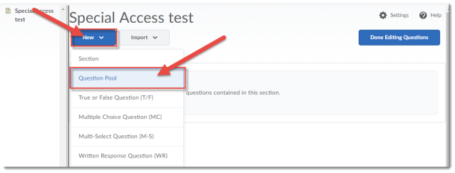
  • Click New, then select Question Pool.
    Click New, then Question Pool
  • Give your Question Pool a title, add a number for the Number of Questions to Select (for example, if you put 100 questions in the Pool, you may want students to see 10 random questions from that Pool), add Points per Question (all questions in a Pool have to be worth the same number of points), and then click Browse Question Library.
    Give your Pool a title, a Number of Questions to Select, Points per Question, then click Browse Question Library
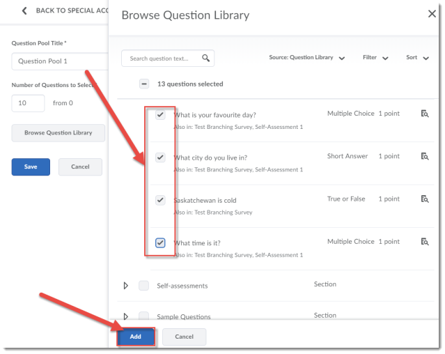
  • From the side panel that opens, select ALL the questions you want your Pool to draw from, and click Add.
    Select your questions and click Add
  • Click Save.
    Click Save
  • Click Done Editing Questions, then finish editing your Quiz and click Save and Close.
    Click Done Editing Questions, and finish editing your Quiz

Changes to Rubrics

Control rubric visibility for learners

There is a new setting in Rubrics (on the Properties tab) which allows you to decide how (or if) your students see your rubrics.  Here are the three options you will now see when you go to create your rubrics:

  • Rubric is always visible to learners (so they can see the rubric before and after you have graded it)
  • Rubric is hidden until feedback published (so they can only see the rubric after you have graded it)
  • Rubric is never visible to learners (so they never see the rubric)

Improvements to rubric feedback for learners

This is an exciting because now rubrics will act the same way in all tools, and be presented to students in the same way in Discussions and Dropbox.  If you remember, students could not see the graded rubric in the Discussion area before, but now they will be able to!

Display graded rubric feedback in Gradebook

Finally, a really nice addition to how rubrics work in D2L.  Now when there are graded rubrics in a Dropbox or Discussion, those graded rubrics will also appear in the Gradebook when that Dropbox or Discussion Topic is associated with a Grade Item!  This means that students can see their graded rubrics in the Gradebook, whether they are attached to a Dropbox assignment, a Discussion posting, or a Grade item.  Exciting times!!

Changes coming in July

I can’t show you these changes yet, as they won’t be available until July.  But here is a preview of some improvements you will see very soon!

Dropbox – New Text Submission type and workflow

Instructors can now create Dropboxes that allow students to create assignment directly in the HTML editor in the Dropbox tool, without having to upload a file.  This will be great for students submitting short (i.e., one paragraph) assignments!

Course grouping tabs in the My Courses widget

Now you will be able to view your courses in the My Courses widget by term. This will make finding courses, when you have a LOT of them in your list, much easier.

Quizzes – Removal of image and text information items

This change is one I am not thrilled about on the surface.  I will know more when I have a chance to see and test this, so don’t get too worried yet.  Image and Text Information are two items available when creating a quiz.  Typically they are used to provide a piece of text (like a cast study) or an image that relates to a series of questions.  These “question types” will no longer be available as of July, but D2L says that you will be able to use Sections to provide the same functionality moving forward.  I hope they are right – we will see…

And those are the major changes coming this month and next in D2L.  I will be back in August to double-check the July changes and update you on anything I find.  Have a great summer!

Introduction to Daylight, Post 6: New Question Creation Interfaces

As we move closer to our upgrade of D2L to what is called The Daylight Experience, I have been publishing a series of posts showing you what the various tools will look like come May.  So far, we have looked at the changes to the Content, Grades, Dropbox, and Quizzes tools.   Today we will finish our look at Daylight with a tour of some of the new Question creation interfaces in the Question Library.

As I noted last time, the changes in the Quizzes are primarily visual, rather than functional. That is, except for some of the question creation interfaces. We’ve now looked at the visual changes in the Quizzes tool itself, and in this post, I will give you a tour of the changes in the question creation interfaces for True/False, Multiple Choice, Short Answer, and Written Response questions.

Note that this will be my last “peek of Daylight” post as we will be making final preparations for our upgrade next week. Stay tuned for posts covering some cool feature changes that have been appearing in D2L (current and Daylight) over the past few months.

Before we start looking at the question creation interfaces, here is the Question Library area in the current version of D2L.

Pre-Daylight Question Library

And here it is in Daylight.

Daylight Question Library

Now, let’s create a True/False question. Remember, to create a question, click the New button and select the question you wish to create.

Here is the True/False question creation interface in the current version of D2L. I have reduced the browser view size by 30% so you can see more of the interface.

Pre-Daylight True False question creation interface

Now, here is the True/False question creation interface in Daylight. Notice that the interface has been simplified so that everything you need to create a True/False question is on one page (no scrolling needed). Just add your Question Text, select the correct answer (True or False), change the Default Points, if needed, and click Save.

Daylight True False question creation interface

If your monitor is large enough, you can see the Preview pane on the right side of the creation interface.

Daylight True False Preview pane

Otherwise, you can click Preview to see the question preview, and click Done when you have finished viewing the Preview.

Daylight True Falce Preview button

Daylight True False Done Preview

Now let’s take a quick look at the Multiple Choice question creation interface. Here it is in the current version. I’ve shown it in two screen shot, as it is a very long interface!
Pre-Daylight Multiple Choice question creation interface 1 Pre-Daylight Multiple Choice question creation interface 2

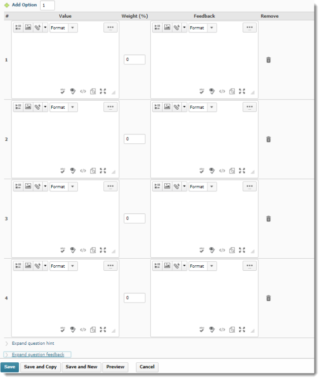
Now, here is the Multiple Choice creation interface in Daylight. Note the Preview pane on the right.

Daylight Multiple Choice question creation interface

And now, here is the Written Response question interface in the current version (note that Written Response used to be called Long Answer).

Pre-Daylight Written Response question creation interface

And here is the Written Response interface in Daylight.

Daylight Written Response question creation interface 1

Note that you can click Options and select Add Custom Response Box Size to choose what size of text box your students will have to answer the question.

Finally, here is the Short Answer creation interface in the current version of D2L.

Pre-Daylight Short Answer question creation interface

And here it is in Daylight. You can have multiple possible answers in blanks, add Blanks, assign how many points each blank has, and decide if the answers need to be case-sensitive. To find out more, register for one of our quiz workshops this spring (https://www.surveymonkey.ca/r/DLMPPR5)!

Daylight Short Answer question creation interface

Note that eventually all the question creation interfaces will have the same design. These will change as we continue our monthly updates after the major upgrade on April 30th.
Thanks very much for reading my Daylight upgrade posts over the past few months. Next month I will be resuming regular posts about our monthly feature changes, tips for how to use some of the tools, and other exciting things happening in eLearning.

Introduction to Daylight, Post 5: The Quizzes Tool

As we move closer to our upgrade of D2L to what is called The Daylight Experience, I have begun to publish a series of posts showing you what the various tools will look like come May.  So far, we have looked at the changes to the Content, Grades, and Dropbox tools.   Today we will begin our look at the Quizzes tool.

Similarly to other changes I have shown you in previous posts, the changes in the Quizzes are primarily visual, rather than functional, except for some of the question creation interfaces. This post, however, will look at the visual changes in the Quizzes tool itself, while my next post will give you a tour of some of those question creation changes, which are both visual and functional!

Here is what the main Quizzes area looks like now.

Pre-Daylight Quizzes tool

And here is what it will look like in Daylight. Notice that the table is much bigger, although it contains all the same rows and columns.

Daylight Quizzes tool

Now let’s take a look at the Edit Quiz area. Here is what it looks like in the current version.

Pre-Daylight Edit Quiz area

And now, see that in Daylight, as with other tools, the editing area takes up much more room due to default font size and cell padding, so even though this Daylight quiz has the same number of questions in the Pre-Daylight quiz shown above, you would have to scroll down to see all the questions.

Daylight Edit Quiz area

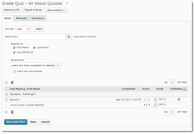
Now let’s look at the quiz grading area.  In the current version, here is what we see on the initial Grade Quiz area.

Pre-Daylight initial Grading area

And in Daylight:

Daylight initial grading area

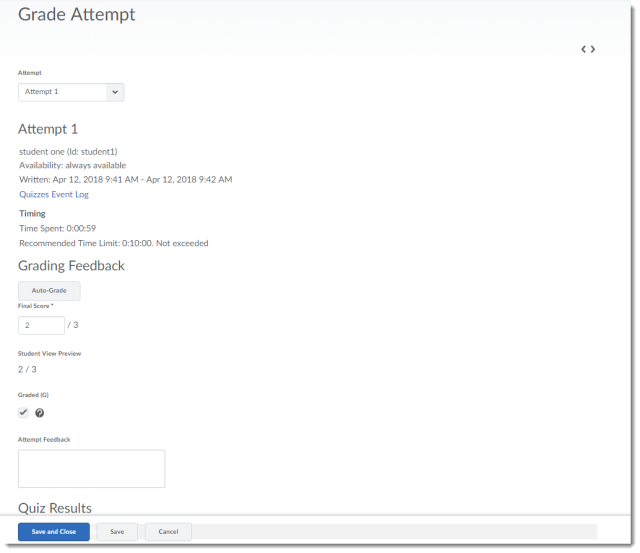
Now, to grade a quiz, here is what you see in the current version

Pre-Daylight individual attempt grading area

And now, in Daylight. Note that for this screen capture, I zoomed out in the browser to 80% of the default size so you would be able to see a bit more of the grading area here.

Daylight individual attempt grading area

In my next post, I will show you the Question Library, specifically the changes in the question creation interface for several question types.

Introduction to Daylight, Post 4: The Dropbox Tool

As we move closer to our upgrade of D2L to what is called The Daylight Experience, I have begun to publish a series of posts showing you what the various tools will look like come May.  So far, we have looked at the changes to the Content and the Grades tools.   Today we will look at the Dropbox tool.

Similarly to the changes in the Content and Grades tools, the changes in Dropbox are visual, rather than functional.

Here is what the main Dropbox area looks like now.

Pre-Daylight Dropbox

And here is what it will look like in Daylight. Notice that the table is much bigger, although it contains all the same rows and columns.

Daylight Dropbox

As with all the tools in D2L, the icons denoting specific functions have changed. You will still recognize the pencil (for edit), the trash can (for delete), and the people (for Groups). The icon noting the connection of a Dropbox to a Grade item has, however, changed from a ruler (see left image below) to a ribbon (see right image below).

Pre-Daylight Dropbox icons Daylight Dropbox icons

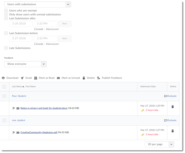
Now, let’s take a look at the Folder Submissions area.

Here it is in the current version:

Pre-Daylight Folder Submissions area

And here is what the Folder Submissions area will look like in Daylight – I’m dividing it into 2 screen shots so you get a better example of the size difference.

Daylight Folder Submissions area part 1

Daylight Submissions area part 2

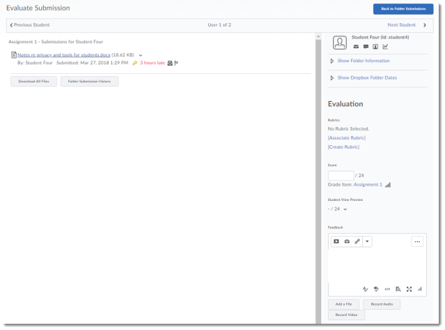
And finally, here is the individual student Evaluate Submission area, first in the current version:

Pre-Daylight individual submissions area

And now, in Daylight

Daylight Dropbox individual submissions area

And there you have it – the Dropbox in Daylight.  In my next post, we will start looking at the Quizzes tool and Question Library.

Introduction to Daylight, Post 3: The Grades Tool

As we move closer to our upgrade of D2L to what is called The Daylight Experience, I have begun to publish a series of posts showing you what the various tools will look like come May.  My last post gave you a glimpse of the new Daylight Content tool design.  Today we will look at the Grades tool.

Similar to the changes in the Content tool, the changes to the Grades tool from our current D2L to Daylight, are about the visual: the white background, the larger font size, more space between items in tables, etc.

So, without further ado, let’s have a look at the changes.

Here is what the Manage Grades area looks like now.

Pre-Daylight Manage Grades area

And here is Manage Grades in Daylight. Notice the change in spacing in the table. This gradebook is identical to the one presented above, but you will not be able to see all the items on one page – you will have to scroll to see the whole thing. Otherwise, the Manage Grades area in Daylight functions the same as it does in the current version.

Daylight Manage Grades area

Now, let’s look at the Enter Grades area. Here it is in the current version.

Pre-Daylight Enter Grades area

Now, here it is in Daylight. Notice again the larger table size which will lead to more scrolling, the more students there are in the list. Notice also that, in addition to the scroll bar at the bottom of the page (which you also see in the current version), there is a scroll arrow at the top of the table.

Daylight Enter Grades area

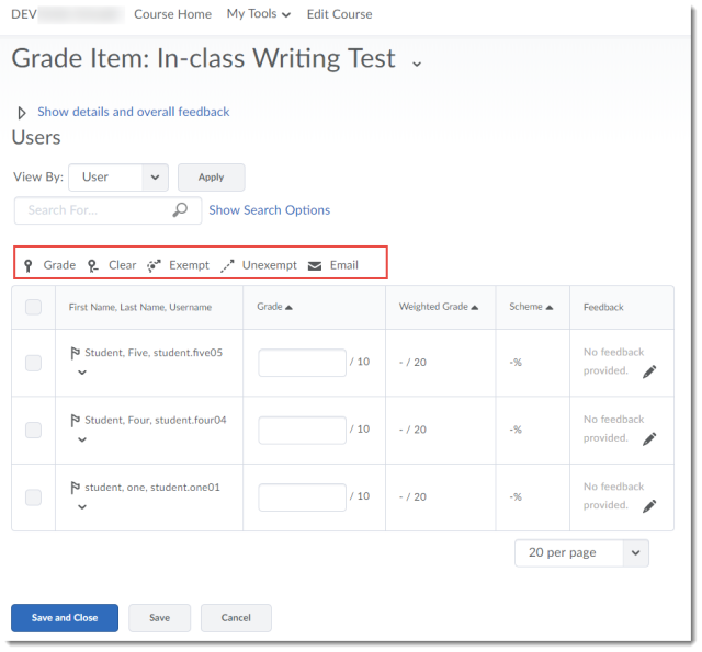
When grading an item, choosing Grade All in the drop-down menu for a grade item (here, for In-class Writing Test), here is the current interface:

Pre-Daylight Grade All Item area

And here is the Daylight interface. Notice that the tool icons (Grade, Clear, Exempt, Unexempt, and Email) only appear at the top of the table (and that the icons have been updates, and are in black and white).

Daylight Grade All Item area

Finally, we will look at previewing a student’s gradebook. First, clicking on a student’s name, then selecting Preview from that student’s drop-down menu (the grading interface for an individual student has not changed). If you are not sure how to preview a student’s gradebook, see the Previewing a Student’s Gradebook pdf.

Here is what this looks like in the current version:

Pre-Darylight Preview Student Gradebook

And here is what it looks like in Daylight. Same gradebook, taking up much more space! And no, the name of the student still does NOT appear at the top of the pop-up window with their gradebook preview…sigh…

Daylight Preview Student Gradebook

To wrap this up, I’ll note that both the Schemes and Settings area have not changes, except visually. You can expect all the same functionality in the Grades tool (for good or bad) in Daylight that you have in the current version of D2L.

Next time, we will have a look at Dropbox in Daylight!

Introduction to Daylight, Post 2: The Content Tool

As we move closer to our upgrade of D2L to what is called The Daylight Experience, I have begun to publish a series of posts showing you what the various tools will look like come May.  My last post gave you a glimpse of the new Daylight homepage design.

And now that you have seen what the new Daylight course homepage will look like, it’s time to take a brief look at some of the other tools in D2L and what they will look like in Daylight. Today we will look at the Content tool.

In general, the changes to the Content tool, as with most of the tools, are visual: the white background, the larger font size, all those things that lend themselves to the responsiveness of the design for mobile devices.

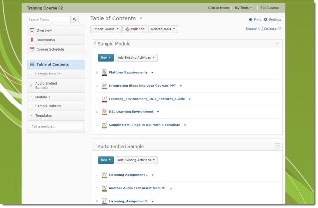
Here is what the Content tool looks like now. Note the placement of the content tool in the course page set against the green background.

Pre-Daylight Content area

And here is what it will look like in Daylight. Note that the Content tool takes up the whole page space, there is no colour background, and how you can see less of the content on the main page without scrolling than you can in the current version.

Daylight Content area

Now, let’s take a side-by-side look at the content in one of the modules.

Pre Daylight sample module with content Daylight Sample Module with content

Not too many changes here, but there are a couple of things to notice. First, in the Table of Contents box, note that the open module is much easier to see in the current version than in Daylight. You really need to look at the main page to see which module is open. Also, in Daylight, the icons have been redesigned, and there is text indicating whether the content is a PDF document, a Link, a Web Page, etc. Here’s a closer look at the Daylight icons here:

Daylight sample module with content closeup to show file icons

One final change is with the Upload File interface.

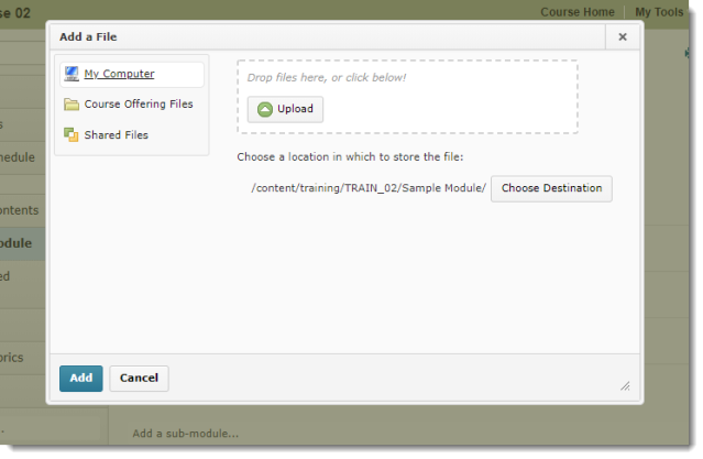
In the current version, if you click New and Upload File, the upload box gives you options of where to upload files from, AND the Upload interface:

Pre Daylight file upload box

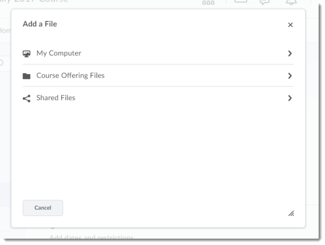
However, in Daylight, the initial upload box you will see gives you the option of selecting files from My Computer, Course Offering Files, or Shared Files.

Daylight File initial file upload box

In this box, you need to select where the file will be uploaded from before you can select a file, so if you click on My Computer, you will then be able to upload a file from your computer.

Daylight file upload box if My computer selected

Aside from these design changes, the Content tool looks and functions the same as it does in the current version, and rest assured that all your content will still be in your courses after the upgrade!

Next time we will have a look at the Grades tool!